In the previous entry on this project, we took a look at what our users want & what the data showed us we should remove.
One thing I didn’t really dive into is how to course-correct for improving activation & retention, two crucial metrics for any software as a service app.
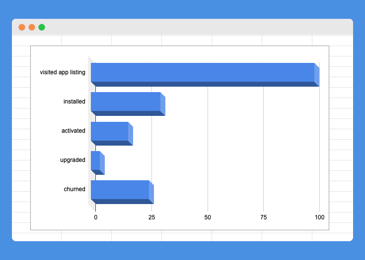
As it currently stands the app has the following metrics:
- 31% people that land our App Store page decide to install the app.
- 54% people activate their account.
- 24% of those people convert from a free account to a paid account.
- 86% uninstall the app within months’ time
Activation
The first problem we’re trying to solve for is activation.
In the case of Contactly I consider a user activated, once they have our widget installed & populated with one of their methods of getting in touch.
As it currently stands, after they find us on the app store & agree to install our app, they right away land on the widget editor page.
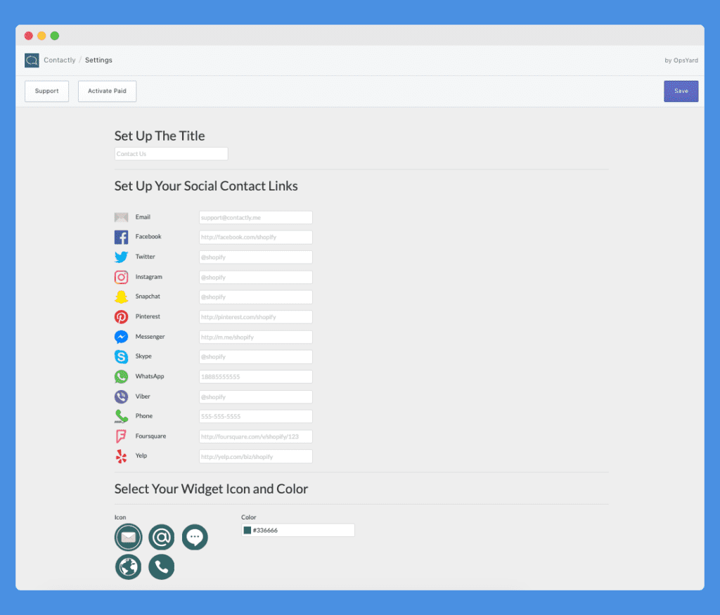
The editor itself is not only overwhelming with the number of fields it shows to a new user but also doesn’t provide any realtime editing, which slows down the process of customization.
In order to customize the widget to reflect the stores branding, users have to copy over the primary color from their existing store by checking within their CSS file.
There’s also no obvious way to check the final results on the actual store the widget will be living on.
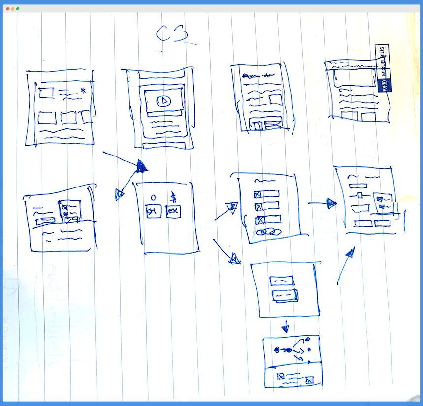
So a couple of things we can do here are:
- Break down adding the data into a more of a chopped up onboarding wizard flow.
- Detect & suggest the color scheme of the theme they’re currently using via checking the Shopify API or using an existing color detection library.
- Reflect the changes to the widget in realtime within the editor.
- Add a button to see a live preview on their store.
Something that isn’t at the app level but is equally important is the onboarding emails & currently, there is none.

Based on previous experience with other apps, the emails that I’ll add to improve activation & retention are:
| For in-active users | For active users |
| Offer Help Incentivize log in Re-engaging with useful content Winning back in-active users | Habitual Use prompts Highlighting key features Upsell Email Share of Referal |
Converting from Free to Paid
Currently, the free plan allows store owners to add one social media account or form of contact to their widget. The paid plan unlocks that to an unlimited amount, that’s it.

I’m personally not a big fan of a freemium offering.
Even-though it increases the number of leads coming through the funnel, in general, it increases the amount of customer support it requires to maintain a happy user base.
Therefore I’ll be switching it to 14 days free-trial during the rebuild. This will no doubt negatively impact the top to mid-funnel metrics, but as long as MRR & churn improved, it’s all good.
One way to make sure people still convert to a paid plan is to shift around the value you deliver to better match what they’re willing to spend on your solution.
In terms of best practices, this usually is reflected in SaaS apps through tiered pricing.
In the case of Contactly, the bottom tiered account ($7/mo) will allow for unlimited social media accounts within the widget + track on which pages people clicked on their social media.
The next step up plan ($15) will introduce email capture (forwarding) & phone call back functionality into the widget. Taking it from just a tool for redirecting shoppers, to actually allowing them to ask a question directly on the store.
This no doubt introduces Contactly to the saturated market categories of chatbots, contact forms & customer support tools.
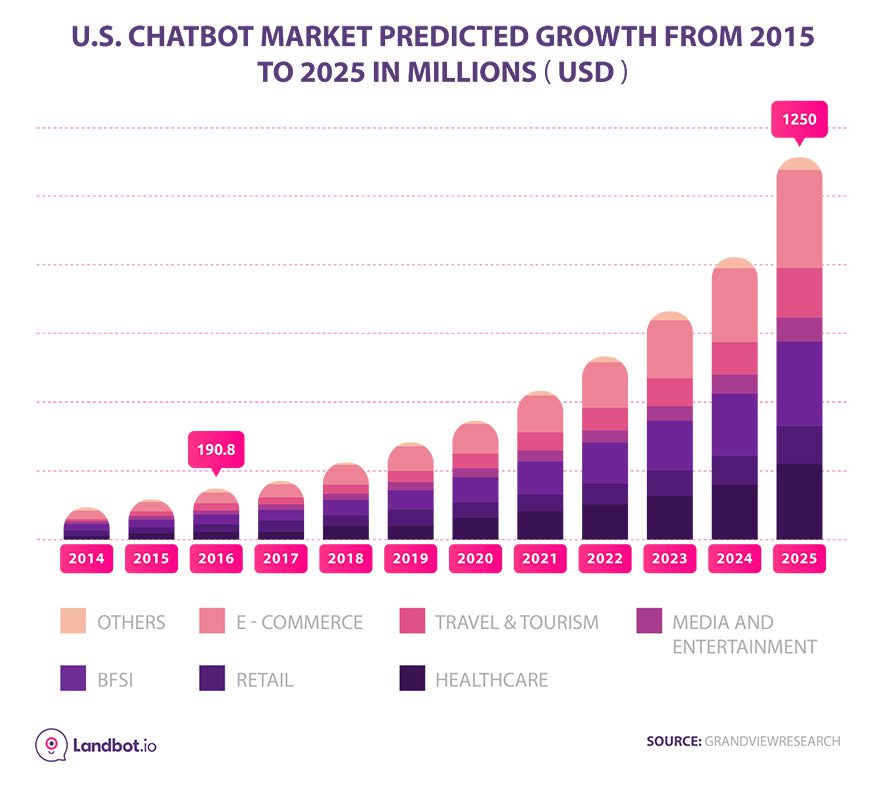
Normally it’s a bad idea to enter a saturated market without significant capital investment into marketing & sales. However, in the case of Contactly being one of many tools in my Shopify app portfolio, I plan on cross-promoting my apps, thus lowering the acquisition effort of new customers.
Going back to the idea of making sure people convert to a paid account, it’s all about the value you deliver & how it correlates to the scale of the problem you’re solving for & how often that problem occurs.
A resource I recommend on this topic is the latest Advance B2B podcast with Corey Haines.
A widget with a bunch of social media accounts is in the nice to have category no doubt, a customer support add-on introduces it into a must-have category, at least for the early stage store owners that we’ll be targeting.
Retention
This can be divided into two categories: people that are on the free trial & there’s a finite amount of time to show them your solution is “worthy” vs the people that starting paying for your tool.
For people that are considering your tool, the best way to make sure they stick around for the long term is to:
- Provide them with an intuitive sign-up process.
- Get them to their first “aha moment” as quick as possible.
- Keep reminding them of the value your providing.

Now, what’s an “aha moment”?
Everyone has their own take on it, but for me it’s the moment when a user clearly realizes the value in your app.
In the case of our default plan for Contactly it’s showing the store owners where his shoppers are pulling up the contact widget & which form of contact are they choosing.
For the more premium plans, it will be the first customer support request coming in from the contact widget.
Since we don’t have any influence on what a shopper might do, one of the ways to get to that first “aha moment” is to have someone on our side provide that first experience to the store owner.
What I mean by that is I could hire someone to check out the stores that recently installed our app, see if there’s something that could be improved about their store & submit that note via Contactly widget.
This also doubles as Q&A for our own purposes, the amount of times I’ve had people mess with their store theme & somehow delete our JS widget in the process is staggering.
Two more things to add are email follow-ups when a user doesn’t convert from the free trial as well as when they cancel after being on the paid plan.
Between the introductions of email marketing automation, redoing the onboarding, adding more value in the pricing structure & adding customer-requested features I think there’s a change that we can improve on MRR & churn.
In the next part, I’ll take a brief look at writing all of this up in a product requirements document in order to start software development on the new version on the app.
